Poster Experimentation
We have chosen to study 'The Last Exorcism' trailer, we have produced 3 posters using 'pic monkey' as planning for our 90 second trailer.
Poster 1
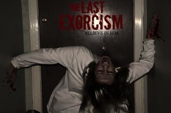
We took a still shot from some clips that we were filming for our 90 second project. We edited this one in 'pic monkey' using the zombie and horror effects. We added blood and text to make it look realistic. We used the same font that is on the original poster for the last exorcism. The actress we used, Chloe, originally had blonde hair but due to good effects and editing we changed her hair colour. In the still shot Chloe has positioned herself in an inhumane way which shows the audience that it is a disturbing film and makes the audience feel uncomfortable.
Poster 2
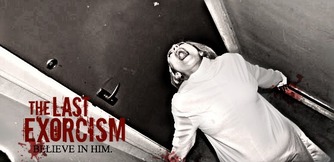
This is also another still shot we have taken from our clips. We added the same effects as the first poster and came out with a different yet effective outcome. This poster looks very disturbing and bright. The bright white gown contrasts with the darkened background, this makes her stand out more than usual.
Poster 3
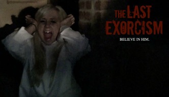
This shot is a still image from our 90 second trailer sequence, it is of the actress Chloe screaming with agony. We chose this still shot because it is effective and draws attention to the poster. The darkness in the background represents horror and suggests it is a dark film, it also shows how alone she is. The white gown contrasts with the blackness and suggests there is still hope.
Magazine 1
For our poster experimentation,
Magazine and poster final
Poster
Our poster is different to many other film posters as most as landscape where as our poster is portrait suggesting that we have created a unique poster and something different to what is already on the market.
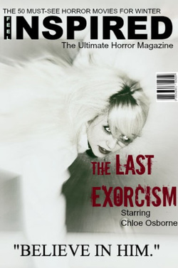
Magazine
Our magazine is simple yet effective. Having the main victim as our iconic image attracts the audience which makes them want to know what happens to her. Our magazine is different to many others as they would usually have an attractive girl or an attractive main character as their iconic image but instead we have been unique and gone with a creepy and sinister character as our main target audience is males.
By Abigail Harris
Our poster is different to many other film posters as most as landscape where as our poster is portrait suggesting that we have created a unique poster and something different to what is already on the market.
Magazine
Our magazine is simple yet effective. Having the main victim as our iconic image attracts the audience which makes them want to know what happens to her. Our magazine is different to many others as they would usually have an attractive girl or an attractive main character as their iconic image but instead we have been unique and gone with a creepy and sinister character as our main target audience is males.
By Abigail Harris
