2. How effective is the combination of your main product and ancillary texts?
We created a series of different branded products such as:
A poster, magazine, and a teaser trailer.
A poster, magazine, and a teaser trailer.
To create the above and below jigsaws, we used a website called jigsaw planet. By putting the pieces together it allows you as the read, observer or audience to piece together our poster and magazine. It will help for you to understand the realism we are trying to portray through both of these branded products.
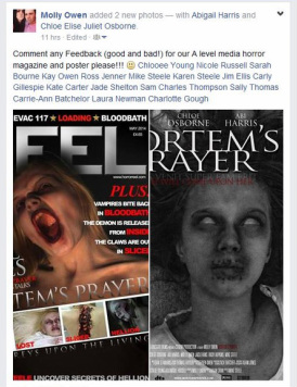
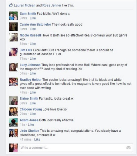
Audience feedback - Facebook
|
|
In the over screen shots,
From our above video we have discovered that our branding was successful though out our products. Using the main victim/killer as our main iconic image has helped us to reach our audience consisting of mainly males. We went against the normal conventions of a film magazine and used a horror image instead of a pretty model pose. It helped to convey the genre of horror across much easier and would make people think about what our trailer would be about from our iconic imagery.
Nothing left to fear -
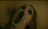
Within our trailer and our poster we pay homage to the trailer 'Nothing left to fear' with the frightening open mouth shot of the demon killer.
Within our trailer and our poster we pay homage to the trailer 'Nothing left to fear' with the frightening open mouth shot of the demon killer.

Here is our version of our iconic image which we thought to be scary and put across to the audience the theme and aspect of horror. We thought it would be an appealing image towards the audience and draw our target audience in. It is different to other magazine covers as they would usually have their main character all glammed up to attract their audience. However as our main target audience is males we wanted to be different and appeal more to their eye as from our research men prefer to see gore in a horror and as we are advertising a horror teaser trailer we wanted to make sure to attract the right audience for the right reasons.
